
Take a look through both the Society and Festival websites, if you haven’t seen them in a while, and you will notice that we have a new color scheme. The Society chooses a new color scheme for the Festival every year to keep things fresh. It is a tradition that dates back to the beginning of the Festival in 2009 and is one of the fun behind-the-scenes collaborations between the board of directors and the staff. It is a particularly joyful exercise for me because it falls within my creative wheelhouse of experience.
Before I joined the Society as Executive Director in 2010, I was a costume designer in theatre and film while also teaching full-time at Rice University as the Director of Theatre, along with a few classes for the Graduate Design Program at the University of Houston School of Theatre. One of my areas of expertise happens to be color and as you might guess, one of my favorite classes to teach is color theory. I love teaching, almost anyone who will listen, how the human eye sees color, the relationships between the different hues, the various approaches to color theory as a scientific study, and in the process, helping others learn that they too can master the art of color.
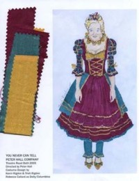
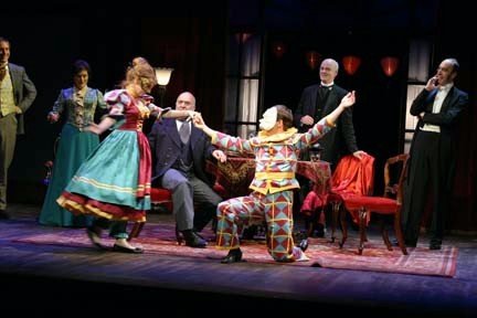
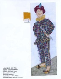
YOU NEVER CAN TELL directed by Sir Peter Hall with costumes by Trish Rigdon, London, West End, 2005.
Each year I start the process with a study of the color trends based on the Pantone color of the year. Pantone is one of the leading color forecasters in the U.S. for the fashion, interiors, and decorative industries. Pantone announces the color annually in January and this year it is a dark wine-red, dubbed Marsala. The next step is to prepare a visual color study for the board of directors to get their feedback — our own bit of market research.
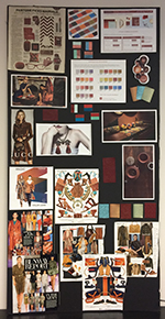
2015 color trend study prepared by Executive Director, Trish Rigdon.
Once we reach a consensus about the direction of the color scheme the next step is to work with our graphics designer, Jenny Conte, principal of Sharp Egg, who prepares mock-ups of the annual marquee poster to show us various options. Then it gets really fun — back to the board for a vote. You will see in the photo illustration how we vote. Everyone tags their favorites with a post-it along with comments. Let the best color combination win!
The result of the vote this year was evenly tied between Lucite Green and Biscay Bay as two companion colors to compliment Marsala. We consulted with the HCAS Marketing Committee to break the tie. In the end, we made a small alteration by brightening up the Marsala with a touch more red. I hope you will like the new colors and would love to hear from you.
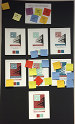
HCAS Board of Directors vote on color scheme for 2015 Festival.
Have you noticed the color change over the years? If you have been a long-term Society member then you can look back at the t-shirts that came with your benefits and see the color history of the Festival. We would love to see all those past t-shirts this year, in fact, stay tuned for an announcement about a designated day to wear your colors at the seventh annual Houston Cinema Arts Festival, November 12 - 19, 2015 — it will be here before you know it.